EMU search
Admissions mailers
One important part of marketing in higher ed is widening the prospective student inquiry pool – that group of prospective students that has shown some kind of interest in the university. This often involves careful study and research on which segments are a good fit and which ones might respond positively to the institution. Names are then purchased based on the selected segments and a specific marketing campaign is developed. It’s important to keep in mind that these are people who have most likely never heard of the institution. Response rate will normally not be very high – often less then 1%. That is why the number of names purchased is in the tens of thousands. If you mail to 50,000, one percent means 500 kids who have expressed interest in the university. If the initial research has been done properly and there is good follow-up with the respondents, a large percentage of these inquiries could become applicants.
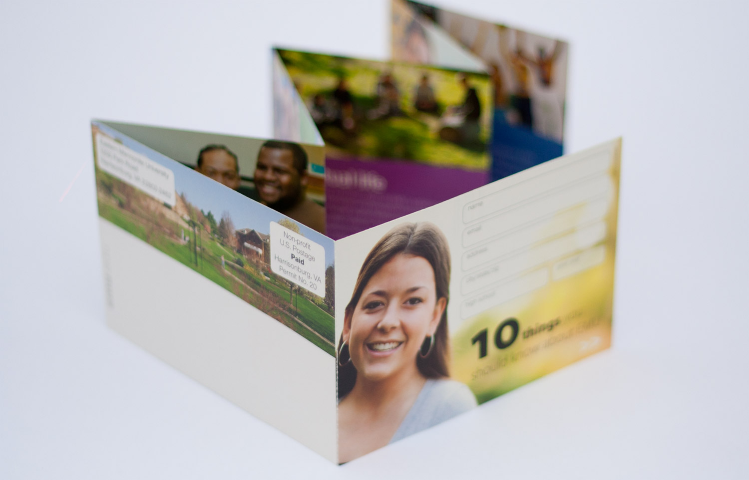
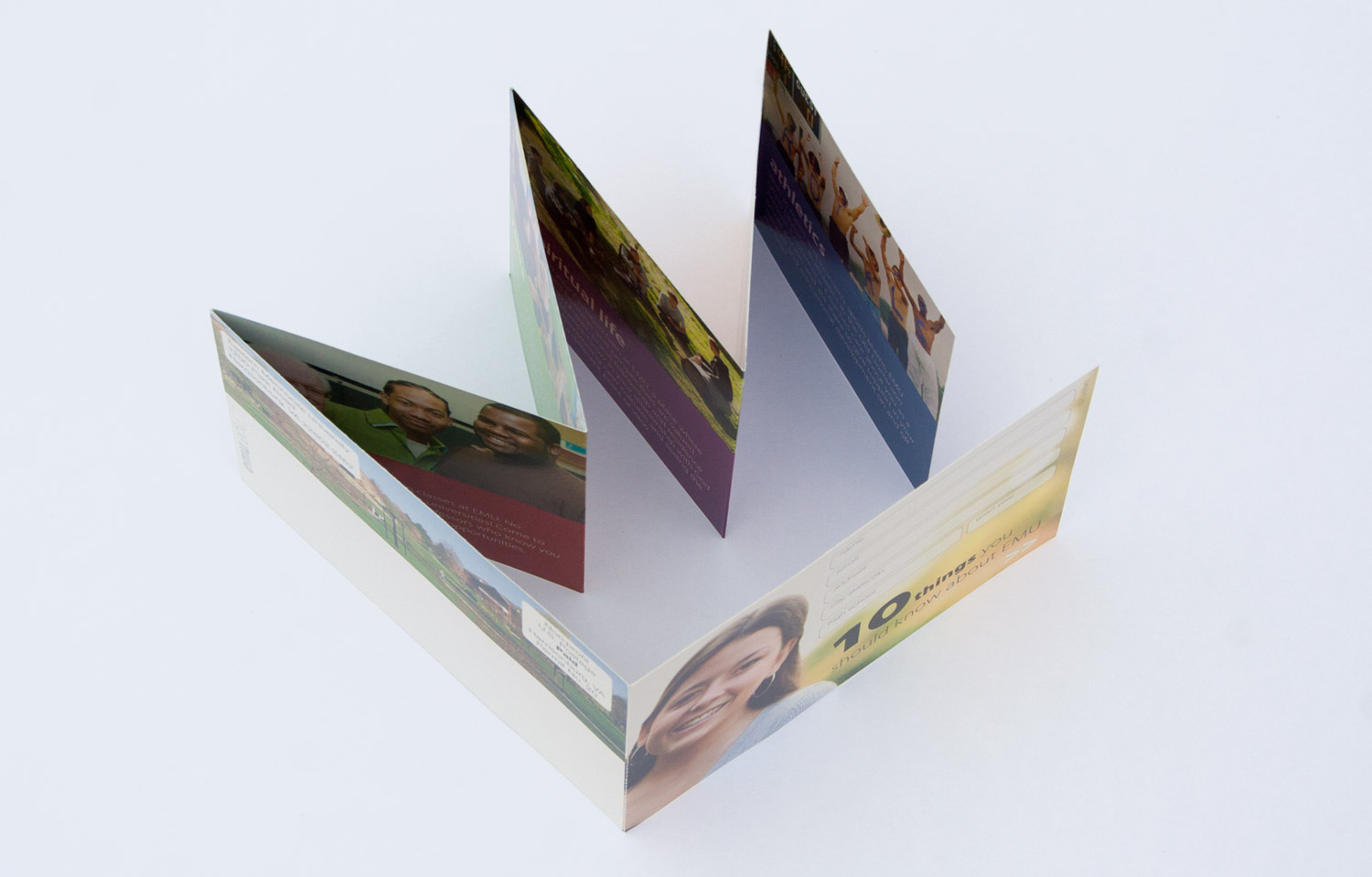
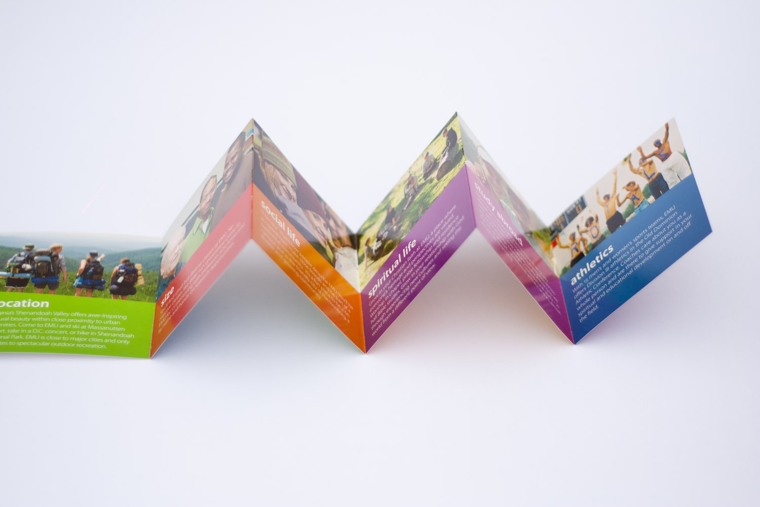
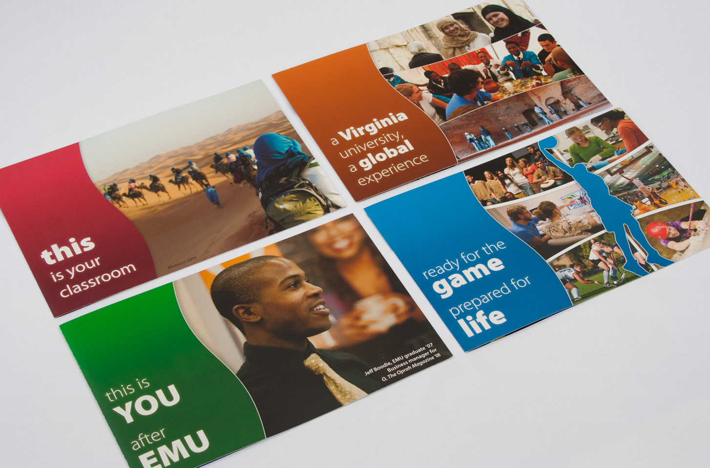
Before 2010, the university sent out a single direct mailing piece with a response card to the entire list. The first images to the right show the 2009 piece which I designed.
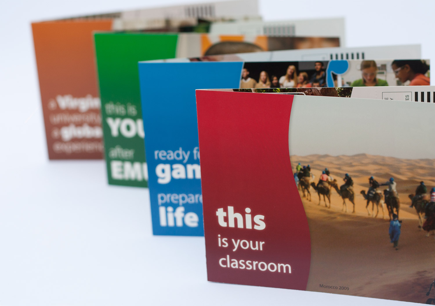
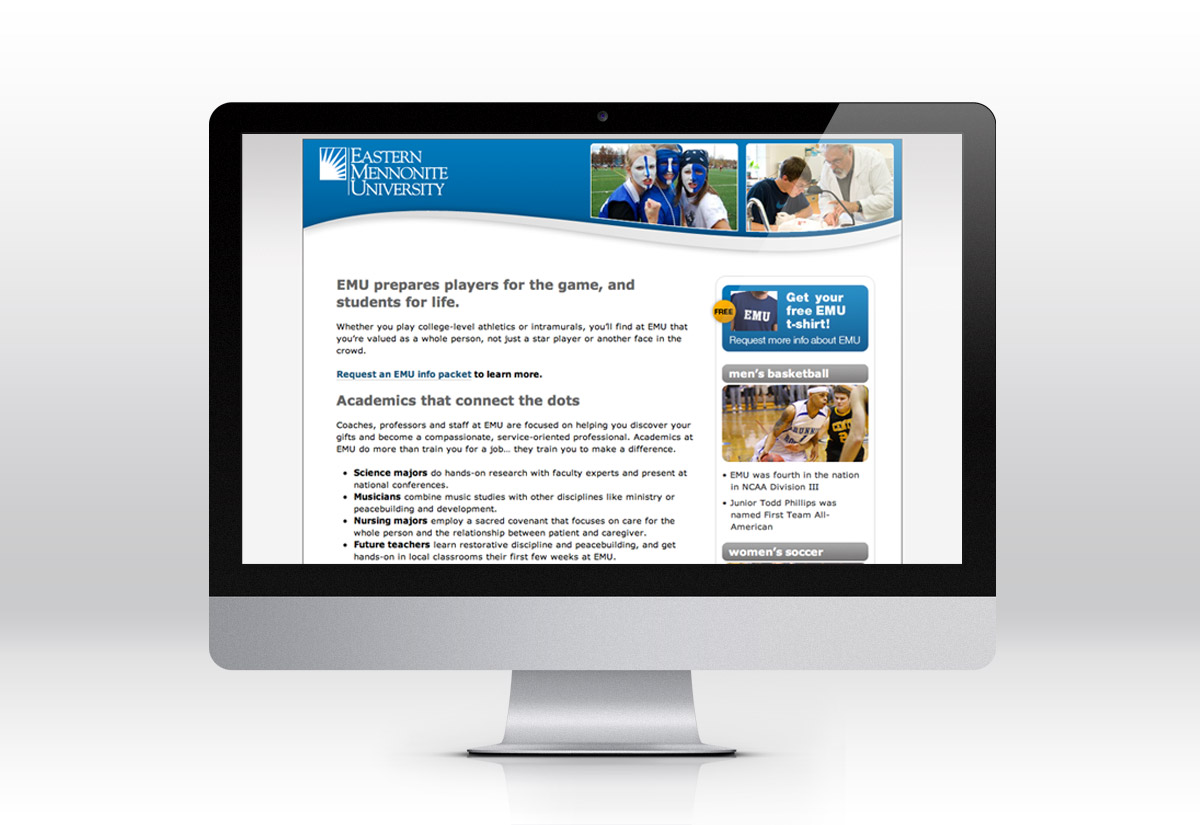
But in 2010 we decided to shift from a single direct mailing piece to a series of mailers. This allowed us to narrow the focus of each mailing, get the university name in front of the recipients multiple times (instead of just once), and to raise curiosity by unveiling the university distinctives progressively. Along with the marketing pieces sent via snail mail, the prospective students received emails that tied-in thematically and directed them to landing pages on the EMU website where they could read more or request further information.
The challenge
Create a 3-piece card series.
The cards should:
- focus on prospective students who are not yet familiar with the university
- raise curiosity
- highlight three of the university distinctives
- solicit a response
Develop a follow-up campaign using electronic communication.
The solution
- Develop 3 simple postcards with striking images
- Cards should have matching design and should focus on: cross-cultural study, athletics, success after grad
- Make the last two cards double-wide and folded, allowing for a portion to be returned as a reply card.
- Provide an extra incentive to return the card by offering a free t-shirt.
- Follow up each postcard with a matching email with link to a landing page with more info, details and profiles.
What I did
- Designed 3 postcards/mailers
- Provided templates for use in email campaign (the actual emails were set up by an outside group that had previously contracted to do it)
- Developed online landing pages for each card and related email campaign (more details)
The results
Overall the campaign was a great success! The return rate on the card series was significantly higher than any results EMU had ever had on this particular type of mailing. Each landing page received hundreds of hits from unique visitors as a result of the email. Many went on to request more information or spent time on other EMU web pages.
Mike offers the rare combination of gifted designer, as well as wordsmith and big picture thinker. Mike isn’t afraid to ask the client tough questions about message intent so he can be sure the product does what it is supposed to do: communicate effectively with a target audience.
Andrea Wenger
Director of Marketing and Communications
Eastern Mennonite University
 mike eberly