Integrated Re-Pack and Logistics
Branding for company partnership
Integrated Re-Pack and Logistics (IRPL) is a partnership between Friendship Industries and InterChange – two well-established businesses in the Shenandoah Valley of Virginia. The two companies joined forces to provide this new service that offers businesses a complete package including: re-packaging, storage, refrigeration, transportation and delivery.
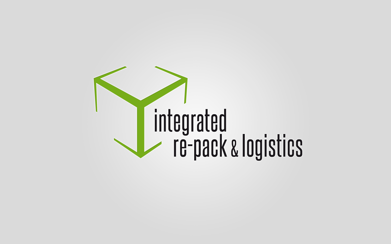
A key component of the brand ID was the development of a graphic mark that reflects the unique brand attributes of this partnership to target audiences. I worked with Gravity Group to develop a logo that does just that.
The challenge
- To develop a simple graphic mark that could represent the wide variety of services offered by IRPL
- The mark should reflect attributes of both companies
- It should give a sense of “movement” (not static)
The solution
I merged the concept of a box and motion (outward-pointing arrows) to create a logo that contains movement as well as a strong connection to what the company does. The abstract box hints at concepts of re-packaging, storage and refrigeration. The sides of the box form abstract arrows that hint at outward movement (logistics, delivery, timely connection).
One of the additional challenges with this project was the length of the name Integrated Re-Pack and Logistics. A shorter, more “user-friendly” name would have been easier to work with. But with every design comes a challenge that must be solved. The use of a condensed typeface and the placement of the text in relation to the icon helped create a well-balanced logo despite the visually-awkward name.
What I did
- Logo development
- Integration of tagline with logo
- Creation of brand ID manual
 mike eberly