International Bilingual School “Maria Montessori” (Mantova)
Website and marketing material
The International Bilingual School “Maria Montessori” is the only Montessori school in Italy to offer a true ‘full immersion’ english program. Located near the beautiful city of Mantua, it offers a stimulating environment in which the child can develop his/her love for learning in a spontaneous way. Children are free to choose the materials they would like to use and may work for as long as the material holds their interest. They are invited to participate in ‘practical life’ activities and to explore their environment.
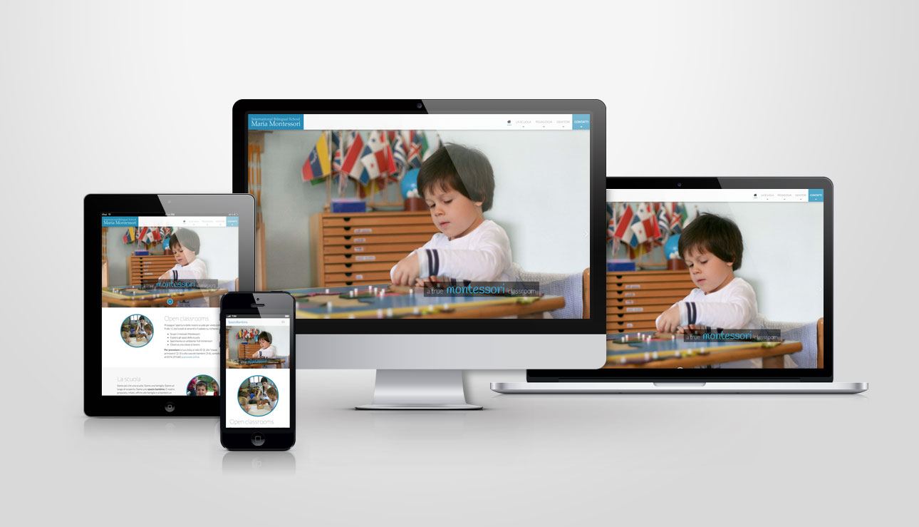
Web
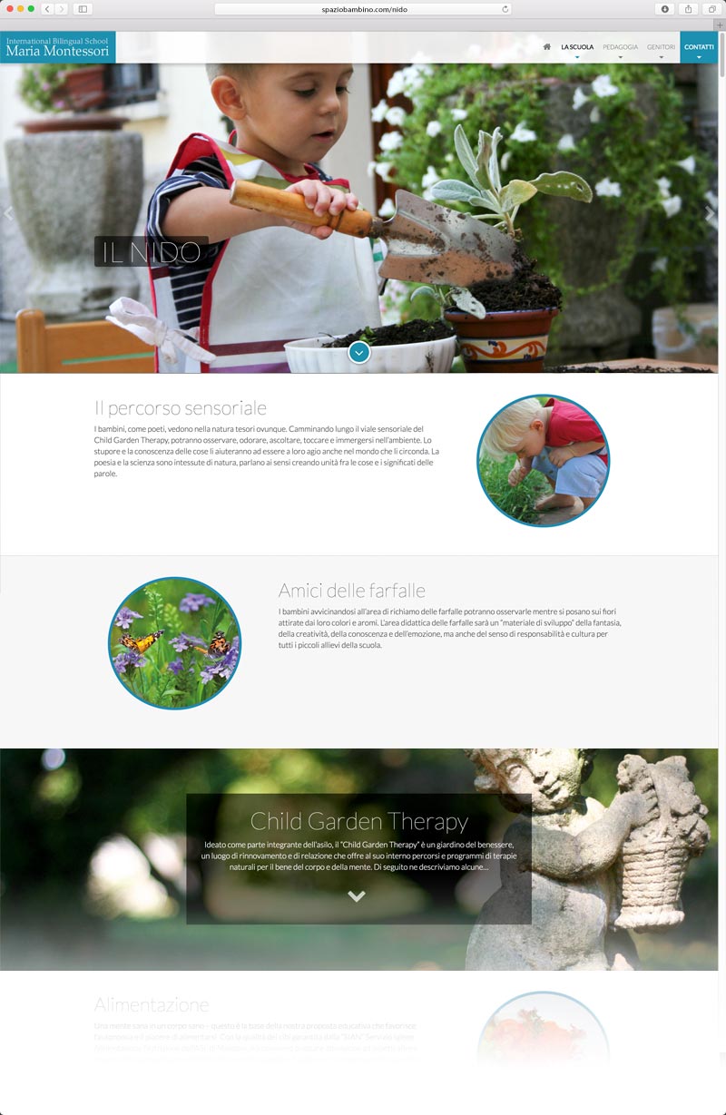
The school needed a website that would serve two main purposes:
- communicate the school’s uniqueness (public website)
- provide a venue for communicating with parents (private parent portal)
What I did:
- WordPress template (created by me), flexible enough for a variety of content, but simple to use
- Password-protected area for parents
- Content development
- Messaging system that emails the parents of a particular classroom whenever a new private article is posted
- Photography
- SEO
- Adword campaigns
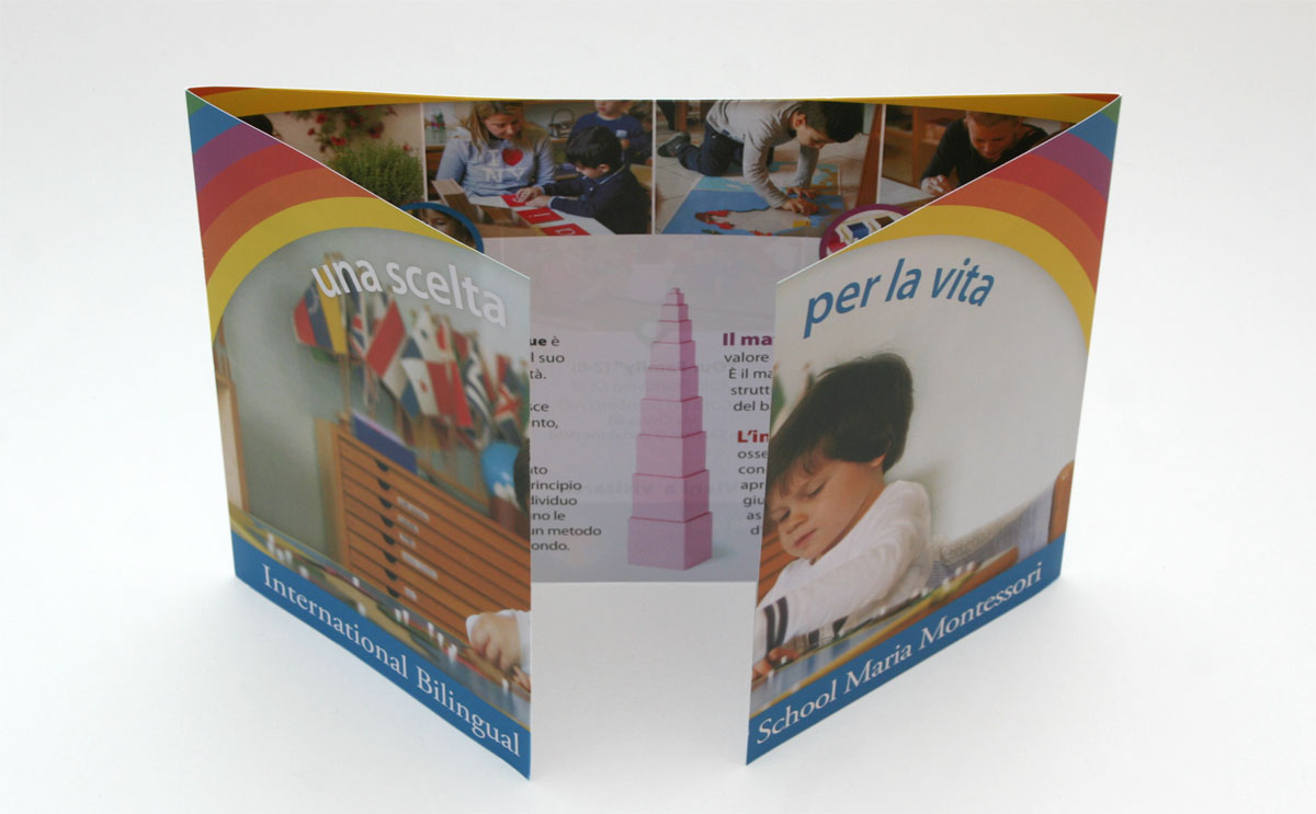
Marketing materials (print)
I also developed a variety of marketing materials including those on the list below. One of the challenges for me was the requirement to work with the school’s logo which is overly-busy and uses pastel color combinations that feel old and outdated instead of modern and forward-looking. At the moment, that is one of the confines in which to work. Hopefully a more modern logo can be developed in the future.
- Material for parents (parent’s guide book, curriculum guide, school manual)
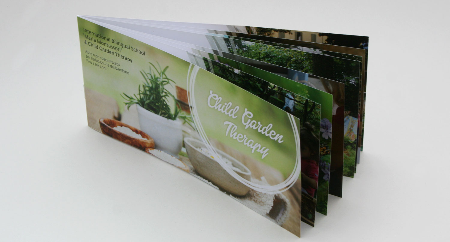
- Pre-K promo brochure
- Nursery promo brochure
- Business cards
- Displays and banners for fairs and special events
 One thing I struggled with on this piece was what to do with the logo. As designers we don’t always have the privilege of starting from zero and developing a company’s identity from scratch. We may be given a logo to use or even a set of design elements which have been used previously in marketing pieces. In this case, I was given an existing logo (see image at right) and was also asked to use the rainbow in some way elsewhere in the piece.
The logo was an issue for me for several reasons. From my perspective, it felt dated and busy. Also, it was built on a pastel color palette, which made the colors feel faded and unexciting. I felt strongly that the piece should stay simple and use strong (more lively) colors. However, I also realized that the client had invested a lot in the logo and that the colors and elements had been chosen for very specific reasons (whether I agreed with those or not).
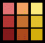
But to everything there is a solution… you just have to look for it. As part of the solution, I developed a palette of complimentary hues based on the colors in the logo. These were the colors I used throughout the main brochure (for example, in the rainbow element) and in other marketing material. This helped brighten up the brochure considerably while preserving a clear connection back to the colors in the official logo.
 mike eberly