Pure Environmental
Identity, print material and web
Pure Environmetal is a provider of services that eliminate pests, germs, odors and contaminants from homes, apartments, hotels and places of work.
When I was initially approached about the project, I was tasked with developing a new website and several marketing pieces. But as we evaluated the best solutions, we came to the realization that what the company really needed before moving forward was a rebranding and repositioning. This was particularly necessary since the company had grown considerably and had added a good number of new services in the previous year.
The challenge
- A growing and changing company would require a refocusing of messaging and positioning
- The length of the parent company name (Pure Environmental Solutions) seemed too long and caused awkwardness in some cases
- The new name and messages would most likely require an updated logo
- The current website did not reflect the various areas of service and was in need of re-organization
- The company was in need of some printed materials
The solution
- Clearly identify the brand promise(s) and key messages
- Use Pure Environmental as the shorter brand name
- Develop a new, simpler text-based logo
- Create a set of accompanying graphics/colors as part of the brand ID
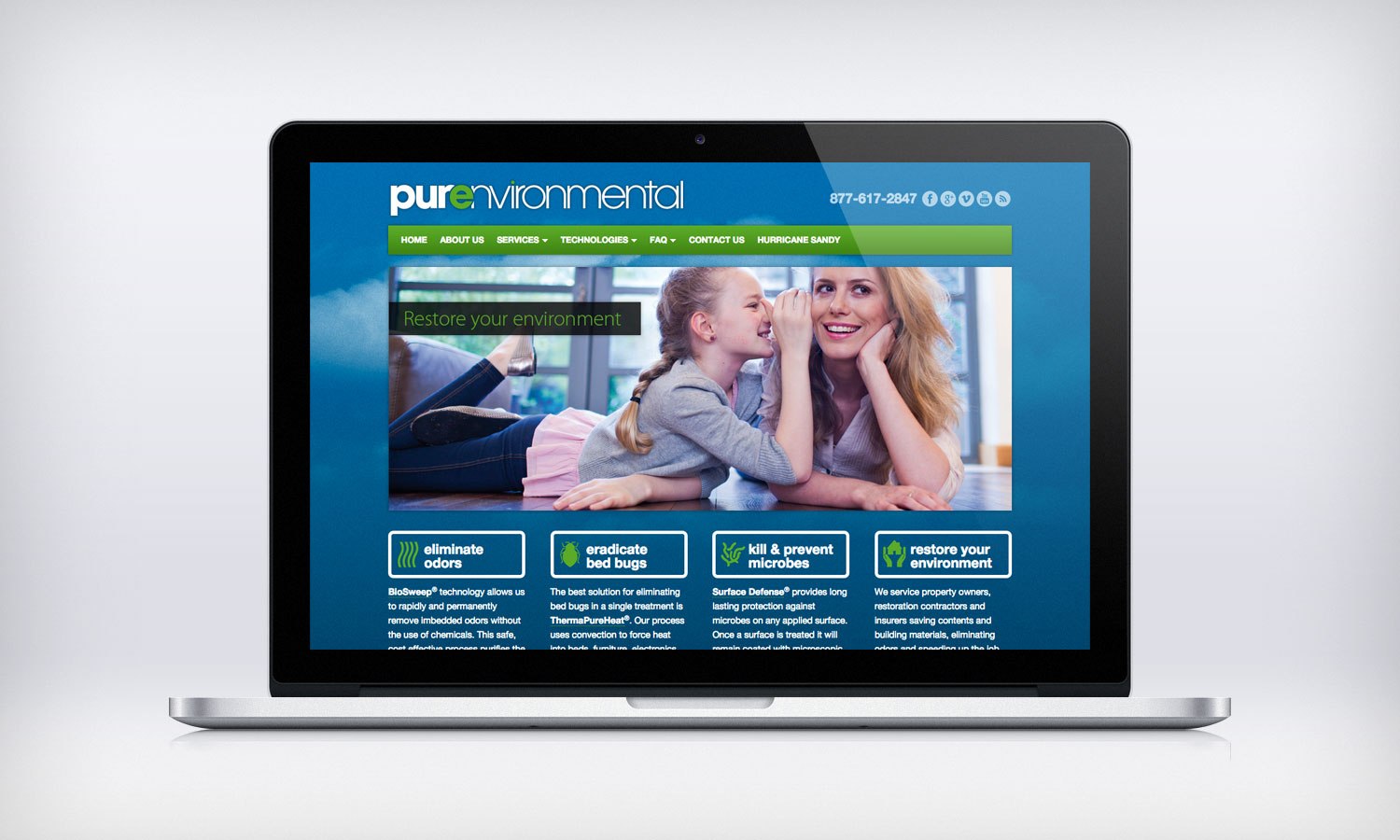
- Develop a website based on the new graphic identity with an emphasis on the four focus area: bedbugs, odors, microbes, restoration. It should be responsive and accessible with any mobile device
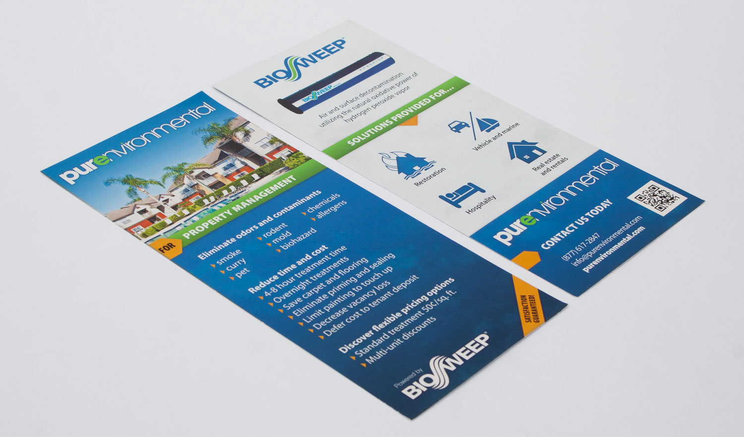
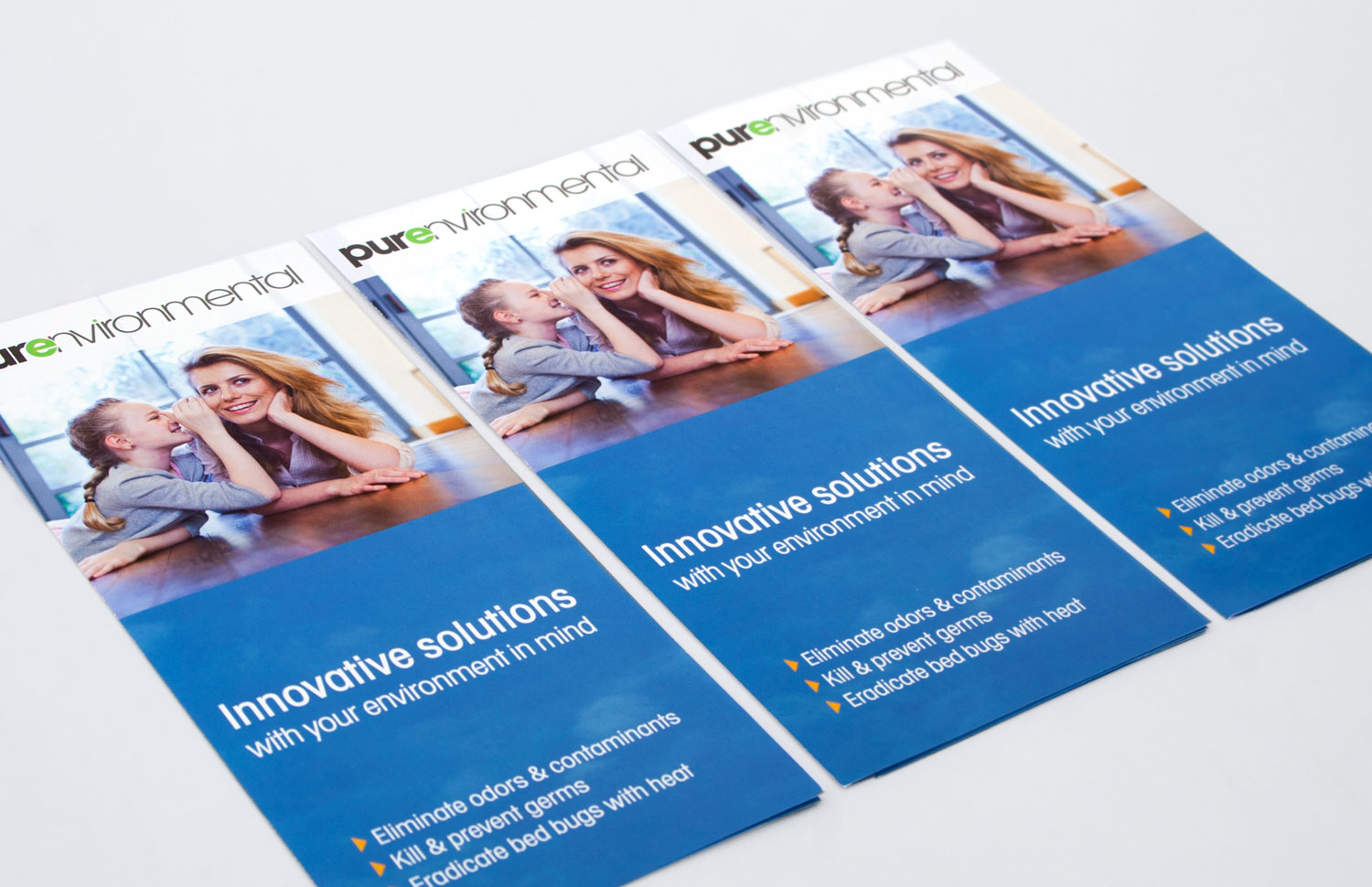
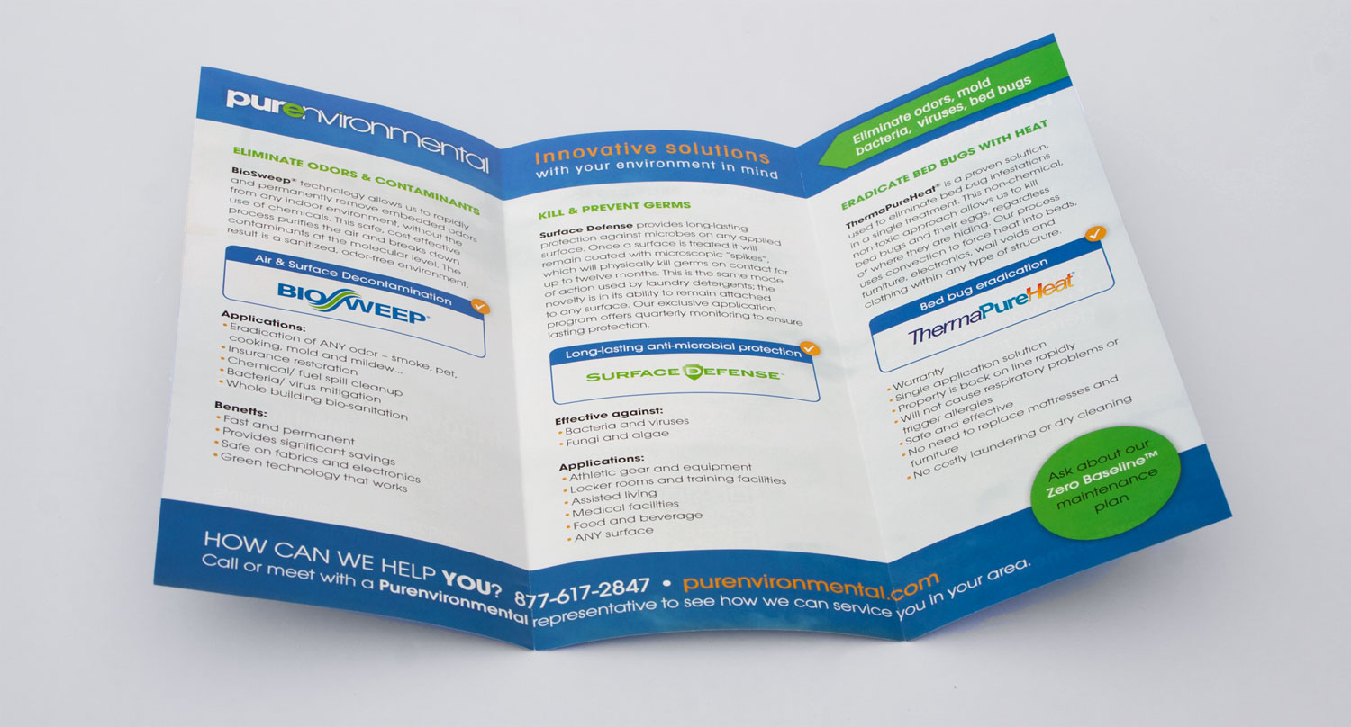
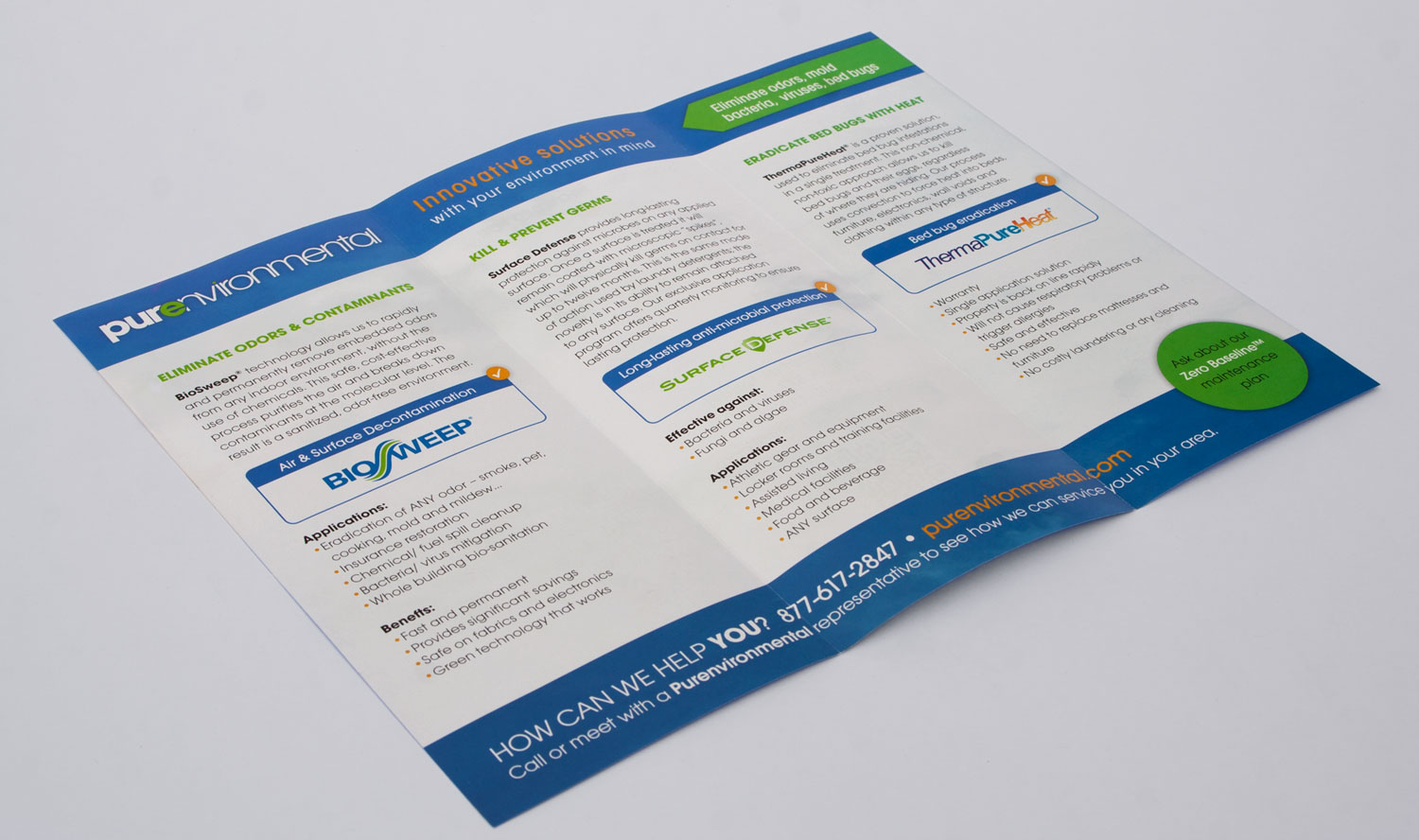
- Design a set of matching print materials (business cards, rack cards, brochure, etc).
What I did:
- Logo design
- Business cards
- Rack cards (series)
- Brochure
- Website design and development
 mike eberly