Re_vive Records
Italian Christian music label
As with many start-ups, the promotional materials that Re_Vive Records had used to get things going had been put together in-house and and on-the-fly as needed. So before even beginning with a new design direction it was necessary to step back and take a close look at the record label’s objectives, the positioning statement, and the intended audience. These were all considered carefully when it came time to develop the logo and identity material.
Besides these considerations, some specific requirements for the logo design included:
- Must appeal to a broad age group, with focus primarily on young-adults
- Must convey that the music produced is “high quality”
- Must include some element which clearly says “music”
- Must reproduce well at very small size for use on CD labels etc (primarily the black and the white versions)
- The underscore (_) must remain part of the name in the logo
At first I struggled a bit with the underscore in the name, feeling like it might cause some confusion and would complicate an otherwise simple name. But the name had already been registered (and besides, “revive records” without the dash was already in use by another record company), so there was no changing things at that point. But as I worked on initial logo ideas it became clear that this very element could be used to our advantage. By emphasizing the underscore we were able to bring clarity to the formal name and use the shape as the key element in the logo. I used that same shape to create the repeated LED levels, which became the main visual tie-in to music.
What I did
- Logo design (versions: color, black, reversed, linear)
- Identity development (color palette, fonts, elements)
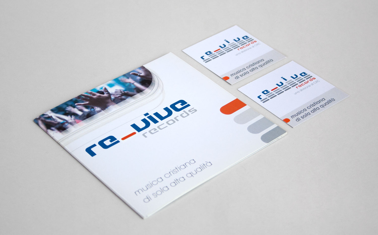
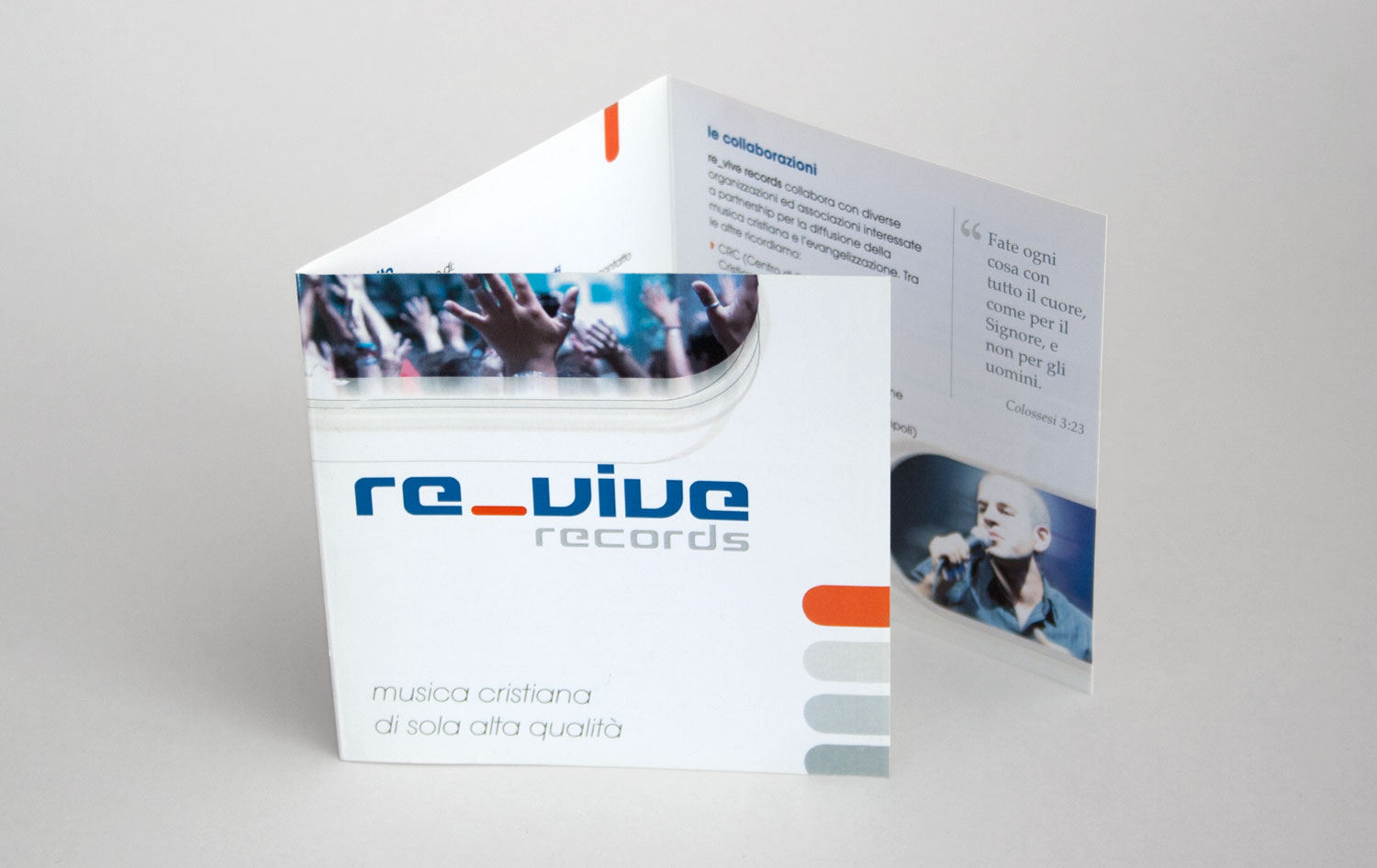
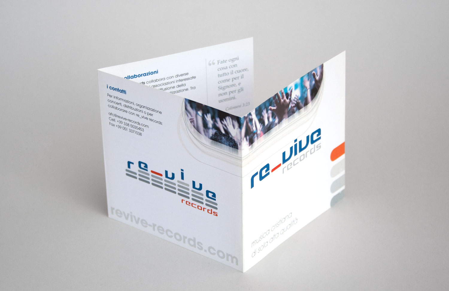
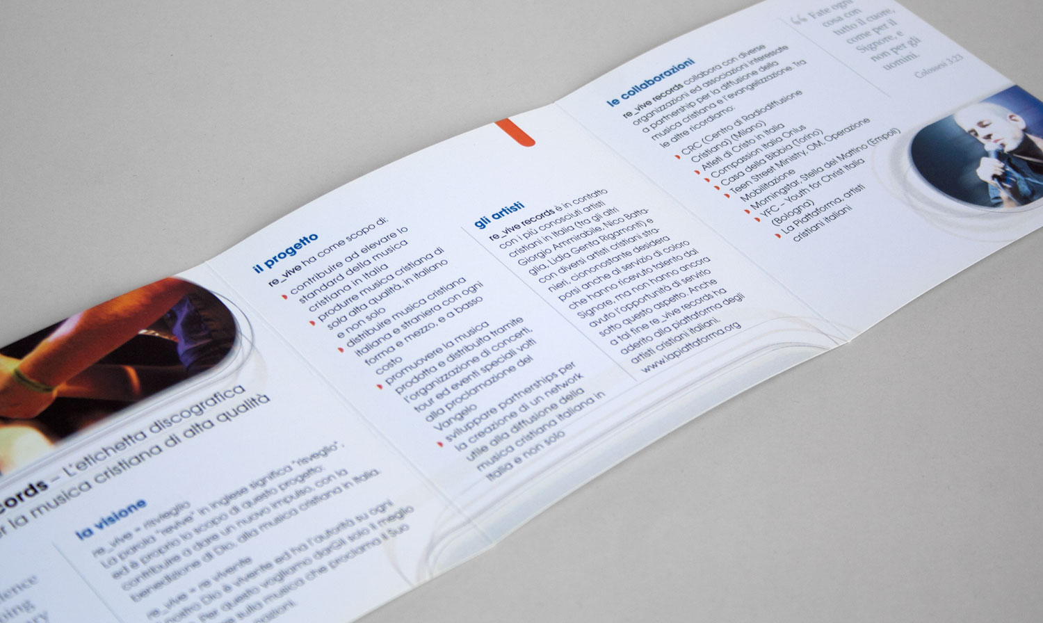
- Brochure
- Business cards
- Online advertising (image and Flash banners)
 mike eberly


